Why UX matters
[Figma] [CSS] [HTML] [Sketch] [Invision]
Want to create software that brings value and people will want to use? Then UX is a component you can’t afford to leave out.
If you’re not familiar with the UX acronym, then we’ve got you covered. UX refers to the term “user experience” and is all about the user’s experience when interacting with an app - or anything else.
“By focusing on UX you’re focusing on making it easier to create something that will bring actual value. Listening to users, seeing how they use their current tools and having an innovative approach helps us create a more successful product."
Anita Kvamme

Anita is the product owner for the Equinor Design System. EDS creates standardized interface components for our developers and designers to use, which frees up time for them to focus on the user experience. She explains that UX entails a variety of techniques, tools and methods you can use to
“UX is like a toolbox that lets you explore what you should be making together with users and the business,” she says.
Please note that all photos and videos for this story were shot prior to Norway's covid-19 restrictions.
What is UX?
- Short for user experience design
- A way of working - not one position
- Home to all function-design disciplines from interaction-, graphic- and service design, to information architecture and concept development
Finding motivation
And a key player in the game that is UX is something as simple as talking to potential users.
“There’s always guidelines and documentation on how to do certain jobs. But in reality, the ways people actually do their job can vary. It’s important to find those nuances,” Mari Skatvold says.
Mari works as a UX designer on Pozo, a tool designed to help us plan better wells. Figuring out how users work, what they’re trying to do and why they’re doing it are also crucial questions to be answered.
“You have to figure out the motivation behind what the users are doing. Understanding why they’re doing something is just as important as understanding what they’re doing."
Mari Skatvold

“Asking your users what they want and need will benefit the entire process. Developing something based on a hunch is incredibly challenging. Focusing on the users can really make a difference if a product is in use or not,” Mari tells us.
Stay in the Loop
No UX, no success
Is UX really the best thing since sliced bread? Let’s check in with the project owners and leaders to see what they say. First up, Tone Berit Ørnskar from the Pozo team.
“I wouldn’t want to start a project like Pozo without having UX as a part of it. It just wouldn’t work. Without people with design thinking competence we wouldn’t be able to understand the users functionality needs fully. To understand what kind of information that needs to be available to trigger users to take action is essential for our project.”
Tone Berit Ørnskar
And it’s that triggering effect of Pozo that they’re after; a feeling that the user understands what he/she can do, and that what they do can be reused later.
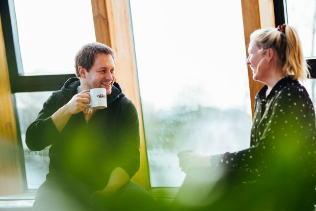

Sometimes, you might be able to take an educated guess on what a typical workday looks like. But when you’re working on something intended for offshore workers, it’s another ballgame entirely, Lavinia Chrystal says.
“I can’t really imagine what a normal work day for an offshore worker is like. Not just the work they do, but all the domain knowledge they have in general. That’s why interviews are so important,” she says.
Lavinia works on Echo, an application that lets users interact with a digital copy of Equinor’s physical assets, like platforms, in augmented and virtual reality. Her colleague Lars-Sverre Dalhaug Eriksen tells us that different people bring different perspectives, which is why the Echo UX team tries to talk to a plethora of people.
“We try to talk to as many people in different positions at different locations as we can. There are different degrees of digitalization across our assets so we have to make sure Echo can work with them all.”
Lars-Sverre Dalhaug Eriksen

All about design
A large part of the user experience is design. Just about everyone’s heard of it, but it’s a term that entails much more than just creating a sketch or making something “look pretty”.
“Good design can be what makes a product complete.”
Per Ivar Selvaag
We dare say he knows what he’s talking about. He’s worked as a designer for BMW and Ford, been the lead designer for Peugeot and started his own agency, Montaag.
Now, we’re lucky to have Per Ivar as Equinor’s own Head of Design. He works on a plethora of projects.
“For us, design thinking helps us understand the business needs that a product aims to fill,” Per Ivar explains.
Finding a better way
While design thinking may have made its way into software development, it’s far from a new term for anyone working with user-centered design. Just taking a stab in the dark and guessing your way to a finish line isn’t necessarily the best way to go about it.
“There isn’t anything wrong with failing fast and continuing trying to solve something. There is always room for making improvement, however,” Per Ivar says.
He believes that design thinking, agile and lean are all part of the same process - but at different stages.
“People have been doing human-centered design for millennia so it’s not anything new. It’s all common sense,” he says.
“We should be focusing on what we’re trying to fix and the problems we need to solve, not methodologies. Then we can use the human- or user-centered design toolbox, which is filled with agile, lean and design thinking, to get there.”
Per Ivar Selvaag
Seeing the bigger picture
The first step of design thinking is research - basically figuring out what your users need and how you can help them. But for the Echo team, it’s not so easy when their users are located 50 kilometers offshore.
You can’t just pop by for an impromptu visit, but thanks to tech they can chat with users directly and even record their screens when they’re using Echo.
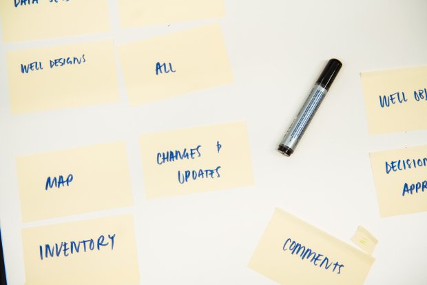
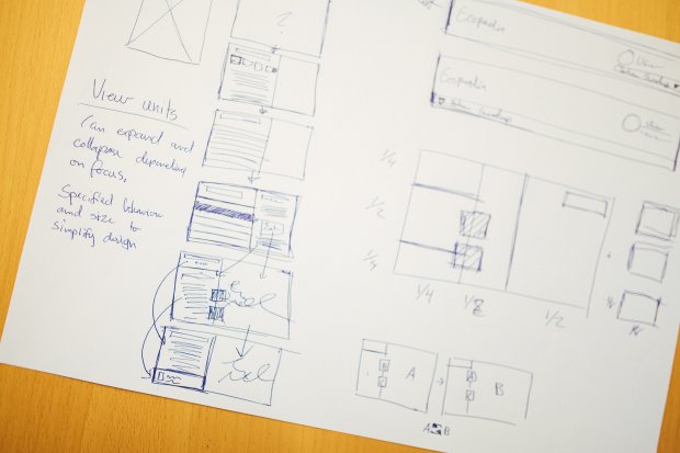
“In our case, everything starts with trying to see the bigger picture of how our app fits into the rest of the workflow. What they’re doing before and after they use Echo is just as important,” Lars-Sverre explains.
And one way to do that is by creating a user journey map. That’s part of the ideation phase, the second stage of design thinking, Lavinia explains.
“You can use the map as a canvas to put together all the information you’ve gathered and sort it out visually. This will help you identify pain points and opportunities you can use further in the ideation phase,” she says.
The user journey map
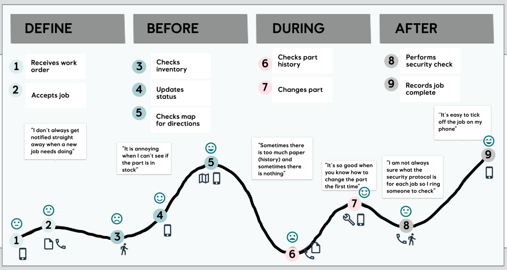
When creating a user journey map like the one above, you get a quick visual overview of the different stages of a process. It covers all phases of completing a task and can be a great way to chart out what needs to improve. Try it out sometime!
This way of looking at the bigger journey is called service design. Widening your scope and looking at this overall view can help your own app, Hege Torsvik says. She works on Pozo, which involves a variety of disciplines that depend on working closely together.
“Most users already have ideas of how to improve the tools they’re using and it’s important to pick up on their thoughts early on. It’s also equally important to find out what already works well in their current tool,” Hege says.


Prototyping rapidly
After doing a ton of interviews and figuring out the path to take, the next step is to work closely with software developers to build the actual solutions that the users want. But that’s easier said than done.
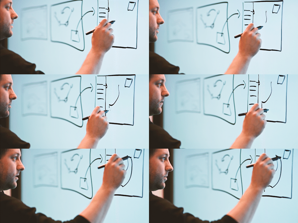
“We spend a lot of time discussing different ideas and creating sketches of what the tool would look like and how it would work before we’re anywhere near the final product,” Lars-Sverre says.
Sketches come in many shapes; from rough drawings on a Post-it to intricate examples.
“There might be 50 different outlines of a product before we choose the final one. We show the user’s prototypes and try to fail fast so we don’t spend too much time on something that’s not going to work,” Lavinia explains.
Usability testing
With a functioning prototype in place, the time has come to let users try it out and do some usability testing. And that’s when you’re able to see that something as basic as a glove can have a big impact.
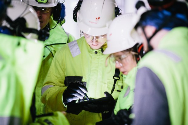
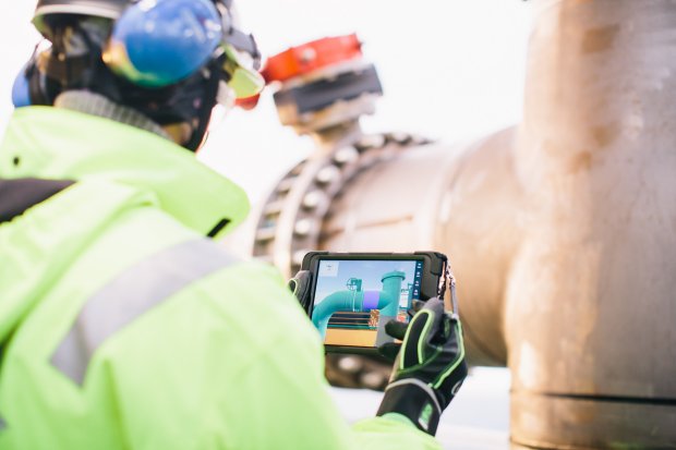
“Everyone offshore has to wear protective gear and gloves make traditional gestures much more difficult on tablets. They’re also wearing tablets in a harness, which can really affect what you display on the screen,” Lavinia says.
“We would never know about these things if we didn’t talk and observe users or get a prototype out as fast as we do,” she adds.
An example of usability testing is the Heinz ketchup bottle. Heinz did usability testing on their glass bottles, and noticed how users spilt ketchup on their clothes or struggled getting ketchup out of the bottle. As a result of that, the easier to use squeeze bottle was born.

“Usability testing is probably my favorite UX method. Seeing how users interact with the product gives you a much better understanding of what works or not. It picks up on problems that users might not realize that they have when you ask them.”
Anita Kvamme
If you’re doing this kind of usability testing on a web app, the first step is to decide upon a set of tasks to test and describe these tasks by using the relevant business language. Then, a user performs the tasks by using a prototype or running solution.
“During the test we ask the user to tell us what he or she is thinking as they’re doing the tasks. This “thinking out loud” technique helps us to see when the solution helps users achieve their goals, and when it doesn’t,” Anita explains.
“It’s not about testing the user’s skills, it’s all about testing our solution. We’re trying to see if they use the product like we imagined and if not we have to change it,” she adds.

Every step of the way
Naturally, there might be a bigger focus on the users wants and needs at early stages in development. But that doesn’t mean that all UX work ends as soon as everything is up and running.
In Pozo’s case, they’re developing tools to help plan better wells. As part of the process, geologists and physicists often choose one concept well as a master - the one they have the most faith in.
If you didn’t select one in Pozo, you’d see a red-colored text displayed to remind you. But when the feature had been in use, they got feedback that it at times was more confusing than helpful.
“While it was meant as a friendly reminder, it caused more problems than help. Our users might not always be in a position where they’re ready to select one master concept, and it ended up pushing too hard,” Mari says.
“Then, we had to make a change on it based on their feedback,” she adds.
With ever-changing and always-evolving domains around every corner, it’s becoming more important to be able to make changes when they’re needed.
Worth every penny
At Johan Sverdrup, Echo and their user focus has helped the asset save countless hours already. One example, Vegar Imsland tells us, was how a mechanic went from spending 12 hours to 8 hours when changing a leaking valve.
“That’s all thanks to the user focus and having all the information he needs available when he needs it, for every step of the way. You won’t be able to get this kind of tailored software without UX,” Vegar says.
He’s been working as a project leader for Echo on Johan Sverdrup. Vegar explains that they saved one month’s work during the execution stage, simply because of new technology and digital solutions. One of these was Echo.
“Saving one month on a large asset like Johan Sverdrup means we’ve saved billions of Norwegian kroners. I believe that the user-focus has played a very large part in this. We haven’t developed anything that there hasn’t been an actual need for.”
Vegar Imsland
UX really can kick in throughout the entire process of your product, whether it’s in mapping out needs to marketing a product and maintaining a customer base.
“If you let users contribute and make them feel like they’re a part of what you’re doing, you’ll get a lot of free marketing. A personal recommendation of a product from someone you trust is going to make you want to try it for yourself too, ”Lars-Sverre says.
So if you’re serious about creating a product that someone wants to use then keep the users in mind - include UX resources in your team. And if you’re serious about staying in the Loop - don’t forget to subscribe to our newsletter below!
Please note that all photos and videos for this story were shot prior to Norway's covid-19 restrictions.
People

Anita Kvamme

Lars-Sverre Dalhaug Eriksen

Hege Torsvik

Per Ivar Selvaag

Mari Skatvold

Lavinia Chrystal